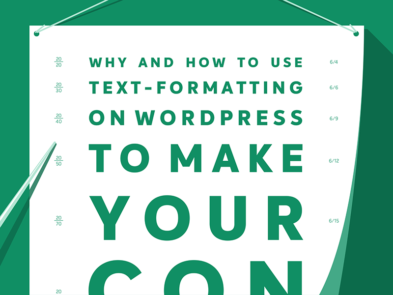
Why and How to Use Text-Formatting on WordPress


Most of us read on small screens on the go these days. Despite that, lots of content is still formatted for large screens and sitting in an office chair!
Just in case you are too giddy to read this post we will answer the first headline question upfront: to make your content readable!
Making your “body text” readable on WordPress is not difficult. You just need to know why it matters and how it’s done. We’ll explain both!
Content to Go
Right now you may be in public transport. You may sit in a car waiting at an intersection.
You may even wait in line at a supermarket.
Why is that important? Isn’t it the new normal? Yeah! It is.
Most people use the Internet on the go these days instead of sitting at home or in the office and reading on large screens.
Desktop computers are a rarity by now and even laptops have been outnumbered by tablets and smartphones. It’s not just the number of devices.
The average usage of screens has shifted from large screens to smaller screens and from static to mobile. Like it or not this is the reality today.
Even large screens are not made for reading. Ebook readers may be the exception but overall screens are good for watching things (think TV) while they are hard on the eyes when it comes to reading. Even binge-watching TV results in fatigue.
Add to it the ever-dwindling attention span of modern Web users and you get the point: it’s hard to get people to read online! You also have to create “content to go”.
Nobody Reads Online
Let’s be honest! How many articles do you read per day on the Web? That is really read. When you start at the very first sentence and read until the last word.
When you’re really honest about your online reading habits you probably say something like 0. You read no articles per day on the Web. When it’s one or more you might also say “read” but mean “scan”. That’s what most people actually do online. There is no shame in it. You can admit it.
Website visitors just skim articles and look for visual cues and the main aspects of the message:
- Images
- subheadings
- lists
These are the types of things that stop you while you look at a piece of content. The actual body text is the content you have written, which gets the least attention.
Studies show that most viewers will just view only the headline. Thus you have to fight for each and every person to stay on your page and read your actual text content.
What happens with those who do not look beyond the headline? In geek speak they just “bounce”! They disappear almost instantly without doing anything on your page.
Walls of Text vs Formatted Text
Writers, editors, and publishers still sometimes assume that you can just create long walls of text like you’d do for books.
When reading books you will often find a paragraph that covers half of the page. Empty or white space is rare, it’s mostly on the margins. Only chapters have headings.
Websites are not books. There you have it! That’s the most important insight of this post!
You can’t write for the Web as if it’s a book!
You need to actually format the text you write, edit and publish and add the aforementioned visual clues to what’s truly important.
Magazines and newspapers sometimes already do that. You’ll see subheadings, images or quotes from the articles inside the content itself.
Make no Mistake – White Space is Added on Purpose
Text-formatting is also about the invisible – so-called white space – that’s the empty room between text chunks that are left for your eyes to rest.
Editors, web developers even designers routinely remove white space because they assume it’s some kind of display error. No, it isn’t. You have to add many line breaks, white space and create small chunks of text.
Sometimes a short sentence per line is enough!
In large teams, you often have to explain the need and use of white space to all stakeholders. Even though it’s a best practice for many years most people still don’t understand it.
When you blog on your own you just have to convince yourself that empty or whitespace has an actual purpose – to make room for strained eyes to look between body text chunks or paragraphs.
When in doubt just add more whitespace. It never hurts to have less clutter while pages stuffed with content actually make it more difficult to read.
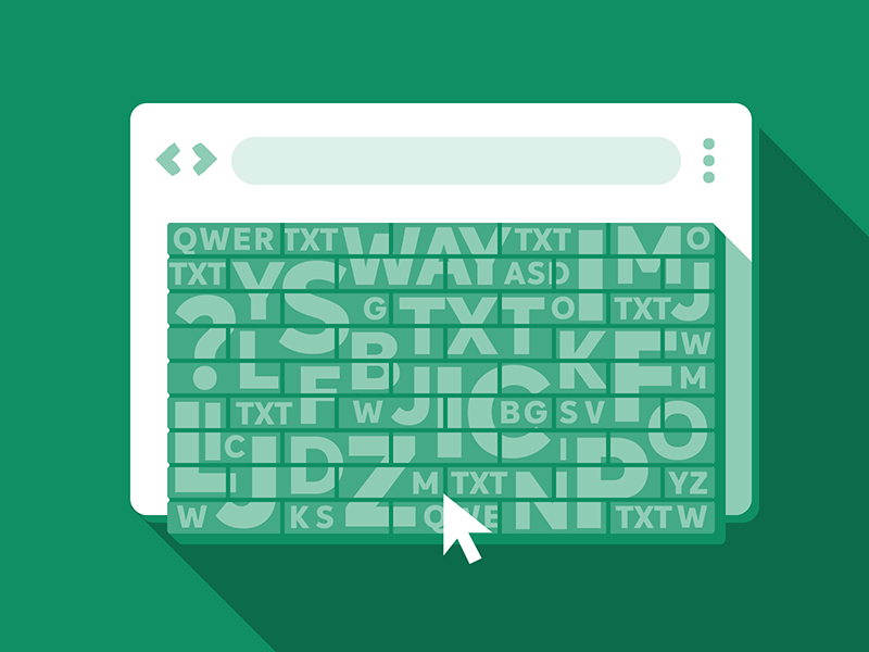
With WordPress Basic Text-Formatting is Quick and Easy
In the past, you had to code text formatting in HTML so that it was really cumbersome even when you did it by copy and paste.
WordPress has several levels of text-formatting available for you. Some of it – the basic text-formatting tools you should use every time – got even easier to access with versions 5 and higher.
Other tools are still there but are a bit hidden so that you only discover them when you are actually looking for them and they don’t distract you.
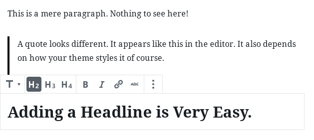
The new built-in WordPress editor called Gutenberg will suggest you different kinds of blocks to format your text.
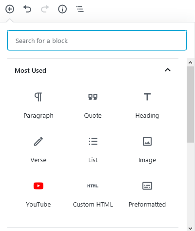
The tools you use most will be shown on top and are based on your past usage on Gutenberg editor blocks. On group blogs, these may seem a bit random because of that. On EasyWP are the top three options are:
- Paragraph
- Quote
- Heading
A paragraph is basically body text without additional formatting. It’s text as it shows with no added features. Don’t overuse mere paragraphs just because it’s the standard options.
Writing long paragraphs is a sure-fire way to lose your visitors’ attention.
Always ask yourself: can I show this sentence, text chunk or message better when using something else than just a paragraph with no added text-formatting? Can I make it shorter? Can I use another block type before or after it?
A quote is usually an indented text chunk that is also often larger than the rest of text and it often features additional whitespace around it.
Most people assume that you have to take quotes literally and only use them when quoting someone.
The underlying “blockquote” HTML tag can be used for anything you’d like to stress. Unlike bold or italics you can use for stressing very short items – like a word or two – without actually becoming distracting – quotes are ideal for stressing whole sentences or even paragraphs. They often offer intriguing insights for people who scan articles before actually reading them.
A heading sounds pretty straightforward yet it can become a bit complicated. Which one do you have to use? H2, H3 or H4? What happened to H1? How many headings make sense? Don’t we have a headline already on top?
Usually the H1 heading is either reserved for the name of the site or the post headline.
Then subheadings are using h2. When you use h2 for the post headline, h3 headings make more sense for spicing up the body text and separating the paragraphs.
Why, When and How to Use Headings on WordPress?
Headings are usually bigger and bolder than the surrounding text. The smaller the heading number the larger the heading – h1 being the biggest one.
Some designers tend to ignore or mix those up so that on some themes or blogs you may end up having most headlines being almost the same size.
For a few years, there was even a web design trend to ignore the h1 – h6 headings and instead just enlarge body text to make it look like headings. Don’t do that! Headings need to be marked up as such. Otherwise visually impaired people won’t actually notice them!
In the worst case, the headline text is even smaller than the actual body text. When that happens you have to fix the WordPress theme stylesheet (CSS).
Ideally, a heading also comes with its own additional white space so that it does not appear to be part of the paragraph itself.
Do not add too many subheadings per post. A few of them are fine but 10 or more only make sense when your article is really long or you have a whole hierarchy of headings.
Sometimes having an h2 heading and several h3 makes sense to make the post readable. Using more than two levels of headings is in most cases redundant though.
On some WordPress themes the h1 will be reserved for the site name, the h2 is for the articles headline and thus the h3 and h4 are meant to be used for subheadings and sub-subheadings.
Unless you write some scientific paper, a serious literary work or an essay for a respectable magazine you won’t need many more headings than h2 to h4 – that’s why the theoretically available h5 and h6 are hidden out of the box.
In general, make sure to add subheadings but again don’t overdo it. Not every two line paragraph needs its own heading so just add more information when it makes sense. sadly most writers still shy away from adding subheadings.
Ideally, you come up with a post structure before you actually start writing the article and thus you already have subheadings as a guide on how to write the rest of the post.
When to use Verse, Lists and Images
There seem to be many poets on our blog! Are you also a poet? Maybe or maybe not.
WordPress Gutenberg suggests “verse” as the fourth most used type of block on our blog. How come? What does verse do? It indents body text, nothing less but also nothing more.
To be honest most people don’t need to add verses to their content. Ignore this unless you publish poetry. Apparently, some of the developers didn’t know how to format text and they used verse to indent it.
The next block in our “most used” overview is “lists” and this one is crucial for readability. In books you will rarely find lists. Yet online anything and everything that has three or more items can be formatted as a list.
Ideally, you use lists on those items that really make sense. But in many cases, it’s not clear from the start. For some people, a list might be redundant. Others will be thankful to get better visibility of items not just in a sentence with several commas.
When you are writing for beginners, listing things works even better as things you take for granted are completely new for them in many cases.
The “images” block should be self-evident. Another question is when and how to use images. Long articles without images are hard to read even when you use all kinds of text-formatting and white space.
Consider using images every two or three paragraphs or for every subheading. This makes it easier to discern the main focus of each part of the body text.
Even though images are not really about text-formatting as they are neither text nor formatting they make text more scannable and ultimately readable by adding very strong visual clues.
Adding images for their own sake makes sense but placing them at different paragraphs is helpful to set those apart.
Just don’t add too many images for the sake of readability. Images have still substantial file size so people may not read your body text because the images take too long to load!
Is Adding YouTube, Custom HTML and Preformatted Text Advisable or Not? It Depends!
The next three Gutenberg blocks that get suggested have pros and cons of using them. Sometimes it’s advisable to add a YouTube video, a custom HTML tag or to use preformatted text. In other cases, it may backfire.
The “YouTube” block allows you to embed YouTube videos with ease. That’s a fantastic feature of Gutenberg. The video stays on YouTube and you just show it on your blog or site. The advantage is that you don’t have hosting costs for showing videos. It might cost a lot of money to host video yourself once it gets popular.
The disadvantage is that a YouTube video you embed might disappear for manifold reasons. Sometimes the owner just deleted it. In other cases, a video will be blocked or “unavailable in your country” for copyright reasons.
Even when the video you display on your site works fine YouTube will show other videos after it ends so that your visitors might get distracted and end up on YouTube instead of reading your article to the end.
Always think twice before adding a third-party widget like YouTube.
- Can you host that content yourself?
- Can you just link it instead of embedding it?
- Will it be around and available a few months from now?
Ideally you both embed and link to the video and on top of that link another source, like the video makers website.
For advanced users “custom HTML” is, of course, a great option. Many things can only get added in the code or are at least easier to add when coded yourself. On the other hand, adding code is always risky. You can break the code.
Since Gutenberg WordPress is trying to fix faulty HTML code. It works sometimes but sometimes it doesn’t. You may end up with even more complications when the code gets fixed automatically. Ideally you don’t touch the code too often and only when you are actually knowledgeable about HTML enough to do it.
What is “preformatted” (text) you might ask yourself. It’s basically body text that already has a certain look and width. A different font is used (Courier New out of the box) and the width is fixed. That way long lines may not find your layout as there won’t be line breaks by default.
When do you need “preformatted” text? Rarely. On most WordPress themes the issue with the long lines will probably appear so it’s better used with caution.
You may use it to signify Internet addresses for example. We did on our permalink post. Yet it broke the layout on long example links so that there was quite a back and forth to fix that.
You may not be able to fix that issue by yourself when you are not a web developer. Thus use that block sparingly and always check the outcome, especially on mobile.
Basic, Advanced and Wrong Text-Formatting Options
There are many more ways to format text content on WordPress. Sadly most people still do not use even the basic ones often enough. Some of the most important are:
- subheadings
- images
- lists
- line breaks/whitespace
- quotes
- paragraphs
For advanced users, text-marker effects are a good solution to highlight important aspects of your body text. As long as you choose the right color they are better for readability than italics.
You can easily create a text-marker effect in HTML and create a custom Gutenberg böock for it. Then it will appear along the other blocks.
Some text-formatting options are rather to be left alone. Strike-through for example only makes sense for text that is not valid anymore.
Some people also tend to add more colors or to underline things to stress significant words or sentences. Don’t do that. Visually impaired people literally can’t see that color.
Underlined text is still mostly used to signify links and even if it isn’t on your site many people will try to click out of habit and think your site is broken.
At the end of the day, you need to keep it simple. Too much or the wrong text-formatting may become clutter in itself.
More articles from us!
